A Minimalist and Modern North Vancouver Home Makeover
Spring is here and there’s nothing like a complete home makeover to signal the start of a new season. Today we’re sharing a beautifully minimalist home makeover by North Vancouver-based designer Lori Steeves of Simply Home Decorating. Lori has an impeccable eye for modern detail and clean lines while incorporating just the right amount of colour. We think you’ll agree that this before and after transformation is ‘simply’ stunning. Take it away, Lori!
I’m thrilled to be sharing this 1990’s home located in North Vancouver’s Lynn Valley neighbourhood with you! We were tasked with updating and brightening a dated home with great bones, and you’ll see as you keep reading why this modern home makeover on the North Shore turned out to be one of our favourite projects to date. With the high ceilings and open concept layout, this home had so much potential and we couldn’t wait to get started. Read on to see how we transformed this home into a modern and timeless abode for our clients, including some of my favourite design tips and tricks to keep in mind if you’re considering updates to your own home, too.
Functionality is just as important as design aesthetic
With any home makeover, functionality and liveability are just as important to us as the style and aesthetic. The kitchen layout was already open and functional so the updates were mostly cosmetic in this area to modernize it to suit our clients’ design aesthetic. We updated and brightened the kitchen with flat, all white doors, minimal hardware and a solid surface marble-look countertop and backsplash.
Modern lighting was used to compliment this space and we also updated the flooring with a high-end laminate option that provides durability to withstand our clients’ two golden retrievers but still brings a contemporary feel.
The kitchen flows into the dining room, and we furnished this area with a custom, made-in-Canada dining table from Once A Tree’s STUDIO collection and Curvo chairs by Trica Furniture to complete the modern, minimalist look.
An open concept living space is the heart of the home
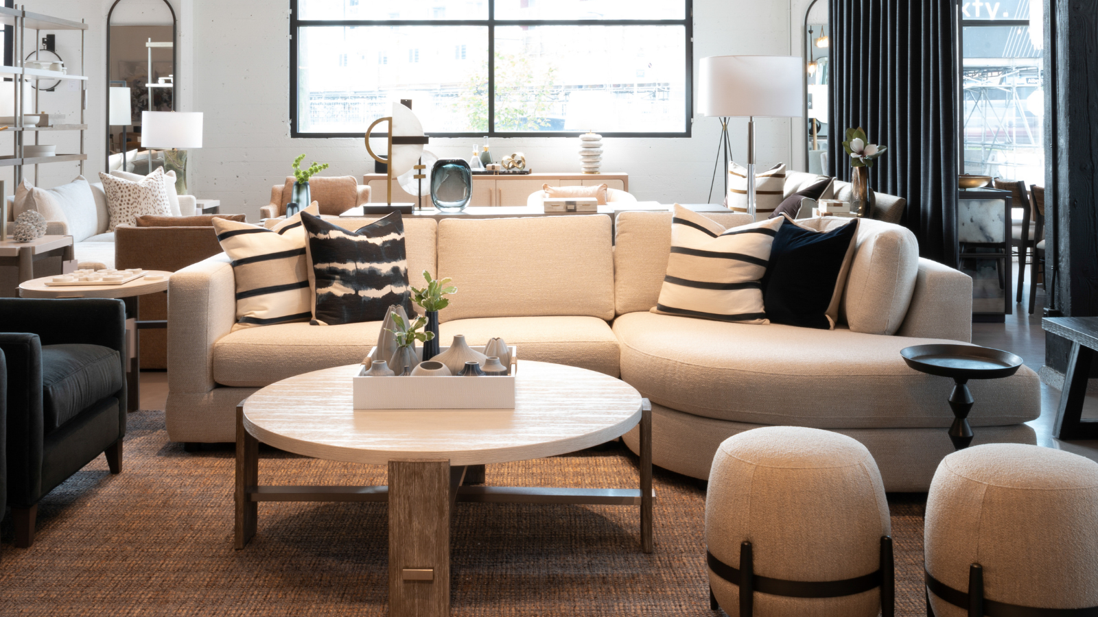
Creating a functional yet modern, aesthetically pleasing open concept living area was extremely important to our clients. There’s plenty of natural light in this room and we brightened things up even more by painting the walls and trims and furnishing the space with lighter-coloured furniture - and one of our favourite pieces is the Ormont Sofa by Canadian-made Marcantonio Designs.
To add elements of contrast and interest to the space, we opted for darker, moodier accent items - like the Clint Cocktail Table, throw pillows and Jaipur rug (which also resembles an abstract painting)!
Create a peaceful sleep environment with personality
Did you know we spend one-third of our lives sleeping?! That’s why it’s always important to us to create a peaceful sleep environment that limits clutter and ensures complete bliss in any bedroom design. We updated the original, darker bedroom with calm and neutral-toned elements that accommodated both of our clients’ personalities and individual design preferences.
By sticking to a cool, gray palette and utilizing different shades and textures (like this Winston Bed by Canadian maker, Huppe), we achieved a peaceful bedroom filled with thoughtfully curated accessories that add a personal touch - such as the floral throw pillow and white cork and foil wallcovering on the headboard wall for a more feminine vibe, and concrete pendant shades and geometric-pattern throw pillows for a more tailored look.
Carry the home’s colour palette through to the bathrooms
With two bathrooms, we took the opportunity to create unique his-and-hers bathrooms in this modern North Vancouver home. Continuing on the theme of modern and minimalist design, we opted for a clean, neutral palette to brighten things up.
To create a bright and airy feel throughout, we incorporated unique, but subtle design elements such as a floating vanity in ‘his’ bathroom and a silver and white cherry blossom wallcovering in ‘her’ bathroom.
Add personality, drama and colour with curated art
My final design tip - that works for any space - is to curate thoughtful artwork throughout your home. Art evokes emotion and creates conversations, and we love introducing clients to some of our favourite local artists and their work.
In this North Vancouver home, we love this original oversized piece by local artist Miriam Aroeste over the Edward Console just off the open-concept kitchen and dining area. This piece adds colour and interest to an otherwise neutral, minimalist space without overwhelming it. For more tips on how to curate an art collection for your home, check out another blog post I dedicated to this topic here.
We hope you enjoyed this modern home makeover tour by North Vancouver interior designer Lori Steeve as much as we enjoyed sharing it with you! Whether you’re redesigning your whole home or just one room in your house, get in touch with us today and we let us help you simplify the process. For more design inspiration and tips, follow us and Lori on Instagram!


